Draft 3
MEDIA STUDIES AQA GCSE: Unit 2: ASSIGNMENT ONE: MAGAZINE ANALYSISMagazine 1
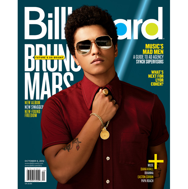
MAGAZINE 1: Title: Billboard
Billboard is an American entertainment media brand that publishes events, style and chart music. Billboard magazine is a mass-market magazine. The target audience for this magazine varies from teens, up to young adults to the age of 26. This magazine is provided for ‘the mainstream’ (young & Rubicam’s 4Cs model) and it is also for the E category Demographics.
The title is the biggest typography on the magazine cover. The font is a practical sans font, which is stereotypically seen as modern. This connotes that the magazine wants to attract more mature readers. They have used a simple colour pallet for the cover and have kept to the same colour pallet on the whole page. This also gives me the impression that the target audience would be teenagers and young adults because its simple and not stereotypically bright and colourful like children’s magazines are. I think that this type of magazine is for people who like chart music; I know this because in America they use the word Billboard instead of saying chart music.
The model’s head (which appears to be celebrity singer, Bruno mars) covers the title, this means that if the model’s head covers the title then the magazine company don’t need to have the whole magazine name because they think that they are well known and therefore do not need the whole title showing on the cover. By using an attractive male they can draw in their target audience of females.
The title and main sub title are white and the background is blue with a gradient, this makes the title and sub-heading stand out against the background, it also looks modern and sophisticated. The masthead is in lower case, which connotes that the magazine is potentially laid back, and friendly. The sub-title that relates to the main image is in block capitals this connotes dominance and power. The colour pallet is yellow, white and blue. This suggests that the target audience is a mixed gender audience; these colours would attract both genders because they appeal to both. Under the subheading it says ‘new album, new swagger and new found freedom’ this could be hinting that the celebrity is brining out a new album.
The fonts are simple and effective, the typography are all the same fonts, some of the headers are yellow, so your attention is drawn to them. The font choice implies that the magazine is serious and professional and wants the target audience to be mature rather than childish. The layout of the text is stylish and simple. This connotes that the magazine includes stylish pages and models; this would interest the target audience and would appeal to them.
The image is the main piece of the magazine; the shot type of the image is medium close up. It takes up most of the space on the page. This means that he is the most important thing on the cover. Although the model has sunglasses on, it appears that he is looking into the camera this establishes a direct connection between the reader and the model. It also gives the impression of power and confidence. The model is wearing stylish clothes, therefore that would also attract the target audience. There are no other images on the cover showing that the main image is the most dominant thing that the company want to show.
The page is uncluttered and neat, the writing is placed around the image however they are not in text box’ so it doesn’t look like a child’s magazine.

MAGAZINE 2: TITLE Rock Sound
Rock sound is a British magazine, which covers rock music. The target audience for this magazine varies from teens, up to young adults to the age of 24. This is because the magazine provides the audience with new music and trends. This magazine if provided for ‘the Aspirer’ (young & Rubicam’s 4Cs model) and it is also for the E category Demographics.
The title has a sensible sans font, although the R has a circle that looks like a paint splatter going around it, it’s the second largest title on the cover but you know it’s the title because its on the top of the page. The main title on the magazine cover is the name of the band that is featured on the cover – (slipknot). This connotes that the magazine is for people who like rock/punk music. The target audience would therefore be for teenagers or adults. The banner is almost as big as the title and it does stand out because it’s got a red strip behind it. This implies that they want the reader to see that there is a ‘poster explosion’ meaning that there is lots of posters which may make the reader want to buy the magazine more because it has posters in it.
The fonts for the sub headings are simple and effective, they are all the same font, some of the headers are white and the text under or above it are red so they stand out on the black background. The word Slipknot is red and is in a different font what looks almost like cartoon blood or paint this suggests that it is not a child’s magazine because the typography is quite mature and children’s magazines don’t have headings that talk about ‘pain’ and ‘heartbreak’. There is only red, white and black in this photo, the colours don’t over power the page, making this magazine appear more professional. These colours connote authority and power (black) , innocence and purity (white) and romantic or blood (red).
The image is the largest and only picture on this cover. They have included a medium long shot. The picture may be scary to some readers also because they are all looking into the camera, which makes it look like they are looking at you. You can tell who the main person of this band because he is at the front and he is the biggest. All of the subjects are wearing black and most of them have weird masks on. The image is the only picture on the page, so all the attention is drawn towards it. The page is uncluttered and neat, the writing is placed around the image not in text box’ so it doesn’t look like a child’s magazine.
When you walk into a shop and look at the magazines you would probably notice this magazine because the picture and the large band name. ‘Alive’, ‘pain’ and ‘heartbreak’ this tells me this magazine if for people who can relate to pain and heartbreak and for people who feel alive.
The producers of both magazines target their audience in the same way by both targeting mature readers for example people aged 13 - 26. However they create a different audience appeal by using different music genres.
Draft 2
MEDIA STUDIES AQA GCSE: Unit 2: ASSIGNMENT ONE: MAGAZINE ANALYSIS
Magazine 1
MAGAZINE 1: Title: Billboard

The target audience for this magazine varies from teens, up to young adults to the age of 26. This is because the magazine contributes the latest updates of chart music and various types of genre. This magazine if provided for ‘the mainstream’ (young & Rubicam’s 4Cs model) and it is also for the E category Demographics.
The title is the biggest typography on the magazine cover. The font is a practical sans font which is stereotypically modern. This connotes that the magazine would like to attract more mature readers. They have used a simple colour pallet for the cover and have kept to the same colour theme on the whole page. This also gives me the impression that the target audience would be teenagers and young adults who like chart music, I know this because in america they use the word Billboard instead of charts.
The model’s head - (Bruno Mars) – covers the title, this means that if the model’s head covers the title then the magazine company don’t need to have the whole magazine name because they think that they are well known and therefore do not need the whole title showing on the cover.
The title and main sub heading is white and the background is blue with a gradient, this makes the title and sub heading stand out against the background, the colour pallete is yellow, white and blue. This suggests that the target audience is a mixed gender audience; these colours would attract both genders because they appeal to both.
The fonts are simple and effective, the typography are all the same fonts, some of the headers are yellow, so your attention is drawn to them. The font choice implies that the magazine is serious and professional and wants the target audience to be mature rather than childish. The layout of the text is stylish and simple. This connotes that the magazine includes stylish pages and models; this would interest the target audience and would appeal to them.
The image is the main piece of the magazine; the shot type of the image is medium close up. It takes up most of the space on the page. This means that he is the most important thing on the cover. Although the model has sunglasses on, it appears that he is staring into the camera this establishes a direct connection between the reader and the model. It also gives the impression of power and confidence. The model is wearing stylish clothes, therefore that would also attract the target audience. There are no other images on the cover showing that the main image is the most dominant thing that the company want to show.
The page is uncluttered and neat, the writing is placed around the image however they are not in text box’ so it doesn’t look like a child’s magazine.

MAGAZINE 2: TITLE Rock Sound
The target audience for this magazine varies from teens, up to young adults to the age of 24. This is because the magazine provides the audience with new music and trends. This magazine if provided for ‘the Aspirer’ (young & Rubicam’s 4Cs model) and it is also for the E category Demographics.
The title has a sensible sans font, although the R has a circle that looks like a paint splatter going around it, it’s the second largest title on the cover but you know it’s the title because its on the top of the page. The main heading on it is the name of the band that is featured on the cover – (slipknot). This connotes that the magazine is for people who like rock/punk music. The target audience would therefore be for teenagers or adults. The banner is almost as big as the title and it does stand out because it’s got a red strip behind it. This implies that they want the reader to see that there is a ‘poster explosion’ meaning that there is lots of posters which may make the reader want to buy the magazine more because it has posters in it.
The fonts for the sub headings are simple and effective, they are all the same font, some of the headers are white and the text under or above it are red so they stand out on the black background. The work Slipknot is red and is in a different font what looks almost like cartoon blood or paint this suggests that it is not a child’s magazine because the typography is quite mature and children’s magazines don’t have headings hat talk about ‘pain’ and ‘heartbreak’. There is only red, white and black in this photo, the colours don’t over power the page, making this magazine appear more professional.
The image is the largest and only picture on this cover. They have included a medium long shot. The picture may be scary to some viewers, also because they are all looking into the camera, which makes it look like they are looking at you. You can tell who the main person of this band because he is at the front and he is the biggest. The image is the only picture on the page, so all the attention is drawn towards it. The page is uncluttered and neat, the writing is placed around the image not in text box’ so it doesn’t look like a child’s magazine. Also there is a colour theme, there are not a load of different colours placed around the page for example, they have used red and white on this magazine. All of the subjects are wearing black and most of them have weird masks on.
When you walk into a shop and look at the magazines you would probably notice this magazine because the picture and the large band name. ‘Alive’ ‘pain’ ‘heartbreak’ this tells me this magazine if for people who can relate to pain and heartbreak and for people who feel alive.
The producers of both magazines target their audience in the same way by both targeting mature readers. However they create a different audience appeal by having different music genres.
draft 1
MEDIA STUDIES AQA GCSE: Unit 2: ASSIGNMENT ONE: MAGAZINE ANALYSIS
Magazine 1
How do these magazine covers engage the interests of their audiences?

MAGAZINE 1: Title: Billboard
MASTHEAD: the title is big, it’s a sensible font, they have put colours inside the letters of the ‘board’ bit of the title. It’s the biggest bit of writing on the page. They have put an outside shadow on each letter, part of the title is covered by part of the models head
This suggests….. that if the modles head covers the title then the magazine company dont need to have the whole title because they think they are well known and don’t need one. The title is white and the background is black so the title stands out.
The target audience…. you cant tell straight away if it is a girl or boy magazine.
BANNER DETAILS: Its quite a small font so it doesn’t overpower the title, it’s a different colour to the title.
This suggests….. its not as important as the other stuff
The target audience…
FONTS:
The fonts are simple and effective, they are all the same font, some of the headers are highlighted yellow, they are also stylish.
This suggests….. that the magazine is serious and doesn’t want to appeal to little kids
The target audience… that the people who buy the magazine are grown up and not immature.
COLOURS:
This magazine cover is all based on black and white, I know this because the title is white, and the articles are white, but the he background is black, also Taylor Swift has got a black and white filter on her.
This suggests….. they have a colour scheme, they probably change it each issue.
The target audience… teens/ adults because its got less colours on than a child’s magazine would.
IMAGE CHOICES: the image is the main thing of the magazine, it takes up most of the page, she is staring into the camera and her hair is getting blown to the side.
This suggests….. she is the most important thing on the magazine.
The target audience…
LAYOUT CHOICES: the image is the only picture on the page, so all the attention is drawn towards it. The page is uncluttered and neat, the writing is placed around the image not in text box’ so it doesn’t look like a child’s magazine. Also there is a colour theme, there are not a load of different colours placed around the page for example, they have used white and yellow on this magazine.
This suggests…..
The target audience… for teenagers/young adults because it does not appear childish athough it has Taylor swift on the cover
MODE OF ADDRESS: lexis ‘grows up’ ‘app wars’ ‘women’ these words are powerful and will draw in people especially women and teenagers who want to relate to taylor swift, or for people who are interested in social media or games on phones.
PUBLISHING INFORMATION: owned by Prometheus Global Media 16,327 (circulation)
There isn’t a barcode ont this.

MAGAZINE 2: TITLE rock sound
MASTHEAD:the title has a sensible font, although the R has a circle going around it, it’s the second largest title but you know it’s the title because its on the top of the page.
This suggests….. the magazine is for people who like rock music
The target audience…teenagers or alults because I don’t thinck children would listern to punk/rock music.
BANNER DETAILS: the banner is almost as big as the title, it does stand out because its got a red strip behind it.
This suggests….. they want you to see that there is a ‘poster explosion’ so you buy the magazine.
The target audience…people who like posters because if it’s a explosion it means that there are going to be lots of posters because explosions are big.
FONTS: The fonts are simple and effective, they are all mainly the same font, some of the headers are white and the text under or above it are red so they stand out on the black background.
This suggests….. its not a childs magazine I know this because childrens magazine have funky fonts and these fonts are quite mature.
COLOURS: there is only red, white and black in this photo, the coulours don’t over power the page, making this magazine appear more professional
IMAGE CHOICES: the image is the largest and only picture on this cover. I think the picture is scary because they are all looking into the camera which makes it look like they are looking at you. You can tell who the main person of this band because he is at the front and he is the biggest.
LAYOUT CHOICES: the image is the only picture on the page, so all the attention is drawn towards it. The page is uncluttered and neat, the writing is placed around the image not in text box’ so it doesn’t look like a child’s magazine. Also there is a colour theme, there are not a load of different colours placed around the page for example, they have used red and white on this magazine.
MODE OF ADDRESS: when you walk into a shop and look at the magizines you would probub;y notice this magazine because the picture and the large band name.
Lexis ‘Alive’ ‘pain’ ‘heartbreak’ this tells me this magazine if for people who can relate to pain and heartbreak and for people who feel alive.
PUBLISHING INFORMATION: Freeway Press Inc. 16,327 (circulation)
The barcode is in the right bottom cornor
$2.50 the price is small and is by the bar code.
This suggests…..
The target audience…
The producers of both magazines target their audience in the same way by….
however they create a different audience appeal by…